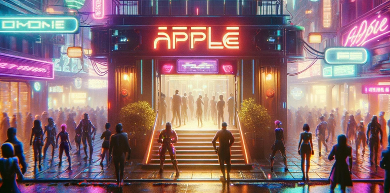
Positive: Great use of the lighting and detail on the title/play screen, the whole idea of being able to customize your character is great concepts to have, and give players the feel of customizing and personalizing the game for each person, as well great choice's for customizing the itch.io page, with custom logo.
Negative: The buttons should have a different background to the rest of the scene, to bring more attention to them, they seem to blend in.
Positive: The title screen shows great attention to detail with 3d modelling intricate neon lighting and other elements like the red carpet. The red carpet, the poles along it, are an example of leading lines to draw the viewer's eye towards the button cluster.
Negatives: While many elements of the menu screen draw the eye towards the buttons, the two black "poles" (in the foreground, and in the middle of the scene) seem to distract from the button cluster with their imposing visual weight. The proximity of the right-hand-side black pole also affects the play screen, making it seem like the back button is attached, and thus appearing closer and more important than the buttons to interact with the character.
The colour of the buttons also matches the neon elements behind them - while it's great to use matching colours throughout the scene to build a uniform visual language, in this case it seems to blur the outline/shape of the buttons.
Hey, great use of perspective to draw attention to the buttons in the menu scene. Also, I like the fact that you can change the colour of the robots individual parts. I think adding a transparent panel behind your buttons might help seperate them from the background and make them more evident to the user. Normally I don't like the use of vibrating colours, but I think with a black and dark grey background the colours work well.
← Return to game
Comments
Log in with itch.io to leave a comment.
Positive: Great use of the lighting and detail on the title/play screen, the whole idea of being able to customize your character is great concepts to have, and give players the feel of customizing and personalizing the game for each person, as well great choice's for customizing the itch.io page, with custom logo.
Negative: The buttons should have a different background to the rest of the scene, to bring more attention to them, they seem to blend in.
Positive: The title screen shows great attention to detail with 3d modelling intricate neon lighting and other elements like the red carpet. The red carpet, the poles along it, are an example of leading lines to draw the viewer's eye towards the button cluster.
Negatives: While many elements of the menu screen draw the eye towards the buttons, the two black "poles" (in the foreground, and in the middle of the scene) seem to distract from the button cluster with their imposing visual weight. The proximity of the right-hand-side black pole also affects the play screen, making it seem like the back button is attached, and thus appearing closer and more important than the buttons to interact with the character.
The colour of the buttons also matches the neon elements behind them - while it's great to use matching colours throughout the scene to build a uniform visual language, in this case it seems to blur the outline/shape of the buttons.
Hey, great use of perspective to draw attention to the buttons in the menu scene. Also, I like the fact that you can change the colour of the robots individual parts. I think adding a transparent panel behind your buttons might help seperate them from the background and make them more evident to the user. Normally I don't like the use of vibrating colours, but I think with a black and dark grey background the colours work well.